The Search UX Patterns Catalog
The user-facing surfaces: autocomplete, facets, result design, snippets, did-you-mean, zero-result UX, conversational search.
About This Catalog
This is Volume 7 of the Search Engineering Series, covering search UX patterns — the interface that translates the engineering work documented in Volumes 1–6 into something users can actually use. The earlier volumes covered the systems that produce search results; this volume covers the surfaces that present them. The two are inseparable in practice: the best retrieval and ranking produce nothing useful if the presentation surfaces them poorly; competent UX can't rescue genuinely bad backend results, but it can multiply the value of good ones.
The volume's perspective. Search UX sits at the boundary between two disciplines. From the search engineering side, it's the last stage of the pipeline — retrieval, ranking, then presentation. From the UX design side, it's a specialized domain with its own conventions and constraints distinct from general UI design. This volume treats UX as a search engineering concern: the patterns covered are those where the search engineer has substantial leverage on the user experience through implementation choices, not general UX/UI design principles. The reader is assumed to know basic interaction design; the value-add is the search-specific application.
Why this volume is structurally different. Volumes 1–6 covered technical disciplines with substantial algorithmic content. This volume covers interaction patterns with substantial design content. The Fowler-style template still applies — intent, problem, how it works, when to use — but the artifacts are different. Where prior volumes showed code, this volume shows component structure, accessibility considerations, and interaction flows. The discipline is the same; the medium is different.
Scope
Coverage:
- Autocomplete and search-as-you-type: the surface that shapes what users type, blending query suggestions, instant results, categories, and personalized history.
- Result list and snippet design: the cards that communicate relevance and afford action; per-domain conventions for e-commerce, content, enterprise.
- Faceted navigation: the refinement UI patterns — multi-select, single-select, range, hierarchical — and the design considerations that apply across all of them.
- Did-you-mean and query suggestions: the UX surface for the spell correction and query expansion that Volume 2 produces; when to auto-apply, when to suggest, when to preserve original.
- Empty states and zero-result UX: the hierarchy of failure modes and the graceful handling of each.
- Mobile and responsive search UX: the constraints and patterns specific to smaller screens, touch interaction, and on-the-go contexts.
- Conversational and voice search: emerging patterns through 2024–2026 as LLM-based search interfaces become production-viable.
- Accessibility patterns: the WCAG-compliant implementation of search interactions for keyboard, screen reader, and assistive technology users.
Out of scope (covered in other volumes or other disciplines):
- The backend systems that produce search results. Volumes 1–5 cover.
- The operations that maintain search quality. Volume 6 covers.
- Visual design conventions (typography, color, layout grids). Covered by general UI/UX literature.
- Platform-specific UI frameworks. Covered by framework documentation (React, Vue, native iOS/Android).
- Content design and copywriting in depth. Covered by content design literature.
- Information architecture beyond search. Covered by IA literature.
How to read this catalog
Part 1 ("The Narratives") is conceptual orientation: what search UX is and where it sits; autocomplete as the most consequential surface; result presentation and the slot model; refinement through facets and suggestions; empty states and graceful degradation. Five diagrams sit in Part 1, illustrating the visual structure of each major UX component.
Part 2 ("The Substrates") is the pattern reference, organized by section. Each section opens with a short essay on what its patterns share. Representative patterns appear in the Fowler-style template, with concrete artifacts — component structure, accessibility requirements, interaction flows — for the central methods.
Part 1 — The Narratives
Five short essays orient the reader to search UX as an engineering discipline. The reference entries in Part 2 assume the vocabulary established here.
Chapter 1. What Search UX Is
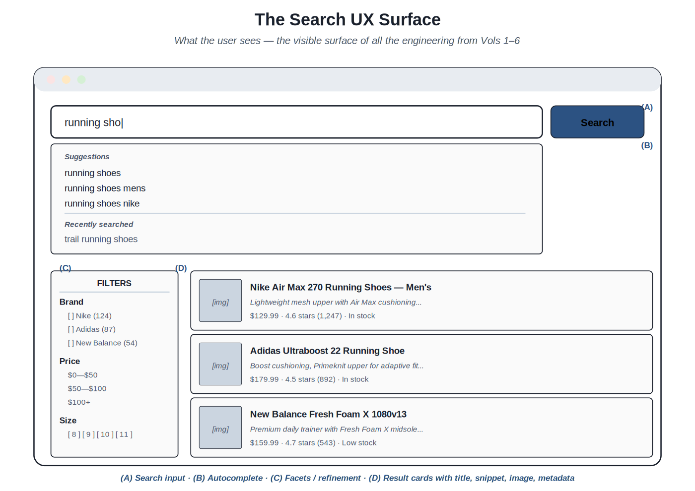
Search UX is the visible surface of all the engineering in Volumes 1 through 6. Users don't see retrieval algorithms or ranking models; they see a search box, a dropdown of suggestions, a list of results, some filters, maybe a "did you mean" link. The UX is what they experience. If it's well-designed, the engineering investment translates into satisfaction; if it's poorly designed, even strong backend results produce a poor experience.
Anatomy of a search results page: search input, autocomplete, facets, result cards. Each element is the visible end of a specific engineering discipline from prior volumes.
The surfaces and their backend connections. The search input is connected to Volume 2 query understanding — every keystroke can trigger query understanding work (intent classification, entity recognition) that influences what happens next. The autocomplete dropdown surfaces Volume 1 retrieval at low latency, plus query suggestions from Volume 6 query log analytics, plus personalized history (UX-layer state). The result cards surface Volume 4 ranking, displaying the documents Volume 3 indexed in the order Volume 4 ranked them, with snippets highlighting Volume 2's query understanding. The facets present Volume 3 schema decisions as user-facing refinement options. The empty state — when search fails to find anything — surfaces Volume 6's operational understanding of what kind of failure occurred and what to communicate.
The surfaces as engineering choices. Each surface has design choices that have substantial impact. Should autocomplete show only query completions, or also instant document results? Should the result snippet be the document's description field or a query-aware extract? Should facets default expanded or collapsed? Should "did you mean" auto-apply at high confidence or always require a click? These aren't just visual design choices — they're engineering choices that interact with retrieval, ranking, and operations. The disciplines connect: autocomplete that shows instant results requires fast retrieval; snippet generation that's query-aware requires query understanding context to flow through; facet defaults inform what the typical user filters down to, which affects what queries reach retrieval.
Why search UX is harder than it looks. Many systems get backend search competent and then struggle to translate that into a good user experience. Reasons include: search UX requires understanding the underlying engineering deeply enough to expose it correctly; it requires UX skills not all backend engineers have; it requires content/copy decisions (snippet length, empty state messaging) that engineers may not be equipped to make alone; and it requires testing against real users, who behave differently than the engineers anticipate. The discipline of search UX is interdisciplinary; teams that can't span the disciplines well typically produce search UX that under-serves their backend investment.
The role of this volume. The volume documents the patterns that bridge engineering and UX for search. The patterns are designed to be usable by search engineers (who can implement them with confidence about their engineering implications) and by UX designers (who can use them with confidence that they're technically achievable). The cross-disciplinary value is the point: search UX patterns aren't purely engineering or purely design; they're the patterns that exist at the intersection.
Chapter 2. Autocomplete and Search-as-You-Type
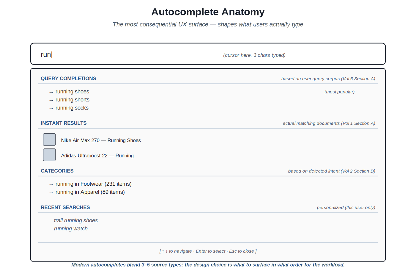
Autocomplete is the most consequential UX surface in search. It shapes what users type — which determines what queries the backend ever sees. A user who would have typed "run" and abandoned because they couldn't finish their thought, but who instead sees "running shoes" in the autocomplete and selects it, has been guided to a better query. The retrieval and ranking that follow are only as good as the query they receive; autocomplete's job is to maximize the quality of the queries that reach the backend.
Modern autocompletes blend multiple source types: query completions, instant results, categories, recent searches — each addressing a different user need.
The source types. Modern autocompletes draw from several sources, each providing a different kind of value. Query completions — prefix matches against the corpus of historical queries — are the foundation; the user gets to see what other users have searched for, which surfaces the established query vocabulary. Instant results — actual matching documents shown live as the user types — let users see candidate documents directly, which can satisfy navigational queries without ever submitting a full query. Categories — scoped suggestions like "running in Footwear" — surface the structured navigation that's available. Recent searches — personalized to the current user — let users quickly return to prior queries. Each source has its place; the design choice is which to surface in what order for the workload.
Latency requirements. Autocomplete must respond within the user's perception of "instant" — typically under 100ms from keystroke to suggestion display. The latency budget is tight. Production implementations: cache common prefixes aggressively; use specialized prefix data structures (tries, sorted suffix arrays) that produce sub-millisecond lookup; pre-compute popular completion sets; debounce keystrokes (typically 50–150ms) to avoid sending requests for every character; fall back gracefully if the backend is slow. Without these techniques, autocomplete feels sluggish even when the underlying search is fast.
Ranking within autocomplete. The suggestions need to be ordered. The signals: prefix-match strength (does the suggestion start with what the user typed?); popularity (how many other users have selected this completion?); personalization (does this user have history with similar queries?); freshness (is this completion currently trending?); business priority (does the team want to surface specific completions?). The ranking is its own learning-to-rank problem (Volume 4); production autocompletes commonly use simple weighted combinations of these signals, with LTR for the higher-traffic systems.
Personalization. Recent searches and personalized suggestions add substantial value but raise privacy considerations. The recent-searches list should be local to the user; the personalization of generic suggestions should respect user expectations about data use. Production patterns: per-user search history that the user can review and clear; clear distinction between "what you searched recently" and "what's popular"; defaults that respect privacy regulations (GDPR consent for tracking, anonymous mode that doesn't personalize). The patterns are workload-specific; enterprise search systems handle this differently than consumer e-commerce.
Failure modes. Common autocomplete failures: showing nothing for short prefixes when something would be appropriate; showing completions that lead to zero-result pages when the user clicks them; surfacing inappropriate or stale completions that haven't been moderated; showing the same set regardless of context (logged-in user, locale, device); making selection difficult on touch interfaces. The discipline is recognizing these patterns and addressing them; the Volume 6 query log analysis surfaces them when they're happening at scale.
Accessibility. Autocomplete needs to work for keyboard users (arrow keys to navigate suggestions, Enter to select, Escape to dismiss); screen reader users (proper ARIA combobox / listbox roles with aria-activedescendant for the focused suggestion); users with cognitive disabilities (clear visual indication of focus and selection); touch users (large enough tap targets, no accidental hover-triggered selections on touch devices). The WAI-ARIA Authoring Practices document the patterns; production implementations should follow them.
Chapter 3. Result Lists and Snippet Design
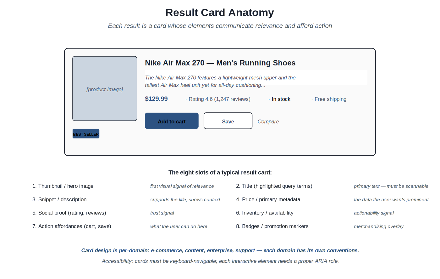
The result list is where ranked retrieval becomes visible to the user. Each result is a card; each card has slots that communicate different facets of relevance. Card design is per-domain — e-commerce products, content articles, enterprise documents, support knowledge bases all have different conventions — but the underlying structure is similar: a primary identifier (title), supporting context (snippet), domain-specific metadata (price for products, date for articles, jurisdiction for legal documents), and action affordances (what the user can do with this result).
Eight slots of a typical card: thumbnail, title, snippet, primary metadata, social proof, availability, action affordances, badges. Domain conventions determine which to include and how to weight them.
The slot model. The eight-slot framework helps think about card design: thumbnail / hero image (first visual signal); title (primary identifier, with query terms highlighted where relevant); snippet (supporting context, often a query-aware extract); primary metadata (price, date, author — the domain-specific datum the user wants prominent); social proof (ratings, reviews, view counts); availability / actionability (in stock, available, accessible to this user); action affordances (what the user can do — add to cart, save, share, open); badges (best seller, new arrival, on sale — merchandising overlays). Not every card needs every slot; the design decision is which slots to include and how to weight them visually.
Snippet generation. The snippet is the supporting context that's shown below the title. Two patterns: static snippet (use a field from the document, like the description) is simpler but doesn't adapt to the query. Query-aware snippet (extract the most-relevant portion of the document's text, with query terms highlighted) is better UX but requires snippet-generation infrastructure. Production patterns: Elasticsearch and OpenSearch provide highlighters that produce query-aware snippets; commercial search platforms (Coveo, Algolia) include snippet generation; custom implementations use libraries like Lucene's Highlighter or build domain-specific snippet logic. The Bass Pro Shops type of workload typically benefits from query-aware snippets where the product description is long enough that the relevant portion is what should be shown.
Highlighting. Within titles and snippets, query terms get highlighted (typically bold). Highlighting communicates why the result matched the query — essential trust-building for the user. Production patterns: highlight the actual matched terms, not just literal query strings (after stemming and synonyms, the highlighted term may differ from what the user typed); highlight across all matched fields (the query might match the title in one term and the description in another); be conservative with highlighting in titles to avoid visual noise.
Card density. The trade-off between showing more results per page (more candidates for the user to evaluate) versus showing each result more richly (better understanding per result). Production patterns: e-commerce typically shows 12–24 results per page in grid layouts that emphasize images; content search typically shows 5–10 results per page with longer snippets; enterprise document search often shows 10–20 with rich metadata. The choice depends on the user task; navigational searches benefit from denser layouts (more candidates visible), exploratory searches benefit from richer cards.
Result diversity. Sometimes the top results are too similar to each other — multiple variants of the same product, multiple articles on the same exact topic. The user wants to see a variety of options. Production patterns: deduplication (collapse near-identical results); diversification re-ranking (re-rank to ensure diversity across results); grouping (show one canonical result with "+3 similar" affordance). The patterns interact with ranking (Volume 4); the UX surface is the visible part of the diversification work.
Accessibility. Result cards must be keyboard-navigable; each interactive element (the card itself as a link, the add-to-cart button, the save button) needs a proper interactive role. Screen readers need to be able to read through the card structure logically — title first, then key metadata, then actions. ARIA labels for icon-only buttons. Sufficient color contrast for text. Skip-to-next-result keyboard shortcuts for power users. The accessibility work is non-trivial but mostly mechanical; the WAI-ARIA Authoring Practices document the patterns.
Chapter 4. Refinement and Reformulation
The user has results. Now they need to narrow down to what they want, or modify their query to get better results. Refinement is the work of narrowing within the current result set; reformulation is the work of replacing the query with a different one. Both happen continuously in practice — users alternate between narrowing facets and revising their query — and the UX should support both fluidly.
Four facet types: multi-select, single-select, range, hierarchical. Each fits a specific kind of attribute; production schemas typically combine several facet types in the refinement sidebar.
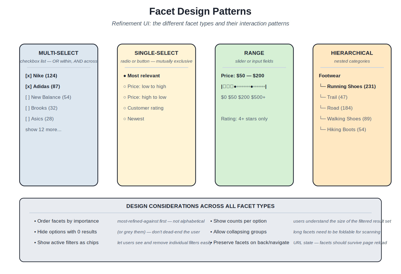
Facet types. Multi-select facets (checkboxes) work for attributes where multiple values are valid simultaneously: brand ("show me Nike or Adidas"), category ("show me running shoes or trail shoes"). The selection logic is OR within a facet, AND across facets. Single-select facets (radio buttons or exclusive buttons) work for attributes where only one value makes sense: sort order (one ordering at a time), price tier (one tier). Range facets work for continuous values: price ranges, dates, ratings; sliders or input fields support setting min/max. Hierarchical facets work for tree-structured attributes: product categories with subcategories, organizational structures, document taxonomies; the UI shows the tree, lets users drill in. Each fits a specific kind of attribute; production schemas typically combine several facet types.
Facet ranking. Not every facet is equally useful for every query. For a query like "running shoes," brand and size and price are highly useful; color and material may be useful; manufacturer SKU is probably not useful. Production patterns: rank facets by their refinement utility for the current query (how much would selecting this facet narrow the result set in a useful way?); promote the most useful facets to the top of the sidebar; hide or collapse the less useful facets. The ranking can be static (per-category configuration) or dynamic (computed per query based on result distribution). Dynamic ranking is more complex but produces better UX, especially for diverse query workloads.
Facet counts. Each facet option typically shows a count of matching results: "Nike (124)" means selecting Nike will yield 124 results. The counts are important user information — they signal which selections are meaningful and which would dead-end. Production patterns: compute counts dynamically based on the current result set (the count for Nike depends on what other filters are active); hide options with zero results, or show them grayed out (don't dead-end the user by letting them select a filter that produces nothing); update counts in real time as filters change.
Refinement UX patterns. Active filters should be visible: typically shown as removable chips at the top of the results, so users can see at a glance what's narrowing their search and can remove individual filters without navigating back to the sidebar. Filter state should persist in the URL: URLs should encode the active filters so back/forward navigation works correctly and shareable URLs preserve the filter state. Filter changes should update results without a full page reload: modern search UI is asynchronous, and waiting for full page loads on every filter click is frustrating.
Reformulation hints. When the user's query produces poor results, the system can suggest reformulations. "Did you mean" for spelling. "Related searches" for query expansion. "Try searching for X instead" for misclassified intent. The hints surface the same backend work — Volume 2 query understanding outputs — in user-facing form. The design challenge is presenting hints prominently enough to be discovered but not so prominently that they distract from the actual results. Production patterns: "Did you mean" at the top of results for high-confidence spelling fixes; "Related searches" at the bottom or in a sidebar; inline reformulation suggestions in the empty state when there are no results.
Search history and saved searches. Power users — enterprise search users, repeat e-commerce shoppers, content discovery users — benefit from history and save features. Recent searches in autocomplete (already discussed). Saved searches that the user can name and return to. Search alerts (notify when new results match this saved search). The patterns add complexity but provide substantial value for the right workloads.
Chapter 5. Empty States and Edge Cases
Sometimes search fails to satisfy. The query returns nothing; the results don't match what the user wanted; the filters narrowed too aggressively. The UX response to these failures often matters more than the engineering behind them. A search system that handles its failure modes gracefully feels reliable even when individual searches go wrong; a system that handles failure modes poorly feels unreliable even when most searches succeed.
Three states descending in severity: partial match, zero-results-with-suggestion, zero-results-no-suggestion. Each state has different UX requirements.
The hierarchy of empty states. Three states by severity. State 1: partial match — the system found some results but they're weak matches, possibly inferred via spell correction or query expansion. The UX should acknowledge the partial nature ("Showing partial matches for X"), offer the inferred reformulation as a clear option, but preserve the original query as a fallback. State 2: zero results, but a suggestion is possible — the system has nothing for the query as typed but has a confident alternative (typically from spell correction). The UX should present the empty state clearly with the failed query visible, then prominently offer the "Did you mean" suggestion as a clickable alternative. State 3: zero results, no suggestion — the system has nothing and no good alternative; the user is looking for something the index genuinely doesn't have. The UX should acknowledge the gap clearly and offer alternative paths (browse categories, popular content, contact form).
The cardinal sin: empty page. The worst search UX failure is showing just "No results" with nothing else. The user is stuck — no path forward, no understanding of why their query failed, no alternative to try. This pattern still appears in production search far too often. Replacing it with even minimal alternatives ("Try these categories instead", popular searches, a search-help link) substantially improves the user experience for the failure case.
Edge case: too many results. The opposite problem from empty: the query was too broad, the result set is enormous, the user can't evaluate them all. The UX should suggest narrowing: show the top facet refinements that would meaningfully reduce the result set; surface related, more-specific queries as suggested searches; provide effective sorting options. Production patterns: pagination (with smart defaults — not just "next page" but "jump to page N" for large result sets); result count display ("1,247 results" communicates the breadth and motivates narrowing); top-result emphasis (the first few results get more visual weight than later ones).
Edge case: latency. Search should be fast but sometimes isn't. The UX matters here too: skeleton screens (placeholder card layouts shown while results are loading) feel faster than spinners; partial results (show what's available immediately, fill in the rest as it arrives) feel responsive; aggressive caching (results from common queries are served from cache, not the backend) eliminates the latency entirely for many queries. Production deployments typically combine multiple strategies; the user-perceived latency target is sub-200ms for autocomplete and sub-1s for full results.
Edge case: errors. Backend errors, network failures, malformed responses — the system should handle these gracefully. UX patterns: clear, friendly error messages that don't expose internal details; retry affordances where appropriate ("Try again" button); fallback to alternative search modes ("Can't reach search; here's the catalog browse"); error reporting (let the team know an error happened, even if the user doesn't need to know the details). The discipline is treating errors as a UX surface that needs design, not just engineering.
The graceful failure mode. The UX patterns documented in this chapter share a common theme: graceful failure. The system can't always succeed; the discipline is succeeding gracefully when failure is unavoidable. Users tolerate occasional failures; they don't tolerate failures that feel dismissive ("No results.") or punitive (the user's query disappears, they have to start over). Graceful failure preserves user intent, offers alternatives, and treats failure as a UX surface deserving care. The pattern compounds: users who experience graceful failure trust the system more, search more, and tolerate more imperfection — which gives the team room to improve over time.
Part 2 — The Substrates
Eight sections cover the implementation patterns of search UX. Each section opens with a short essay on what its patterns share. Representative patterns appear in the Fowler-style template with concrete artifacts — component structure, accessibility considerations, state management — for the central methods.
Sections at a glance
- Section A — Autocomplete patterns
- Section B — Result list and snippet design
- Section C — Faceted navigation
- Section D — Did-you-mean and query suggestions
- Section E — Empty states and zero-result UX
- Section F — Mobile and responsive search UX
- Section G — Conversational and voice search
- Section H — Discovery and resources
Section A — Autocomplete patterns
The most consequential UX surface: shaping what users type
Autocomplete affects more queries than any other UX element — every keystroke is an opportunity to guide the user toward a better query. The patterns in this section document the production implementations: how to blend multiple suggestion sources, how to meet sub-100ms latency targets, how to handle accessibility.
Hybrid autocomplete with query suggestions, instant results, and personalization #
Source: Production methodology at major e-commerce and content search teams; WAI-ARIA combobox pattern; modern autocomplete libraries (Algolia Autocomplete, Downshift, Headless UI)
Classification — The pattern for production autocomplete combining multiple source types with proper accessibility, low-latency interaction, and personalization.
Build an autocomplete component that meets sub-100ms latency requirements, blends multiple suggestion sources appropriately for the workload, handles keyboard and screen reader interactions correctly, and shapes user queries toward those the backend can satisfy well.
Default autocomplete implementations are either too simple (just prefix-matching against a static list) or too complex (every keystroke hits the backend, producing laggy interactions and high backend load). Production autocomplete needs: multiple source types to address different user needs (completions for incremental discovery, instant results for navigational queries, categories for structured navigation, recent searches for return users); fast response (sub-100ms typical, sub-50ms ideal); proper accessibility for keyboard and screen reader users; failure handling when backend is slow or unavailable. The pattern documented here addresses these requirements.
Source blending. The autocomplete dropdown shows results from multiple sources, each in its own section. Query completions appear first — prefix matches against the historical query corpus. Instant results appear next (or interleaved) — actual matching documents, retrieved live. Categories appear when the prefix matches a category name or when intent classification suggests categorical browsing. Recent searches appear for logged-in users or browser-cookie-identified sessions. The blending logic is workload-specific; e-commerce typically emphasizes instant results (users want to see products) while content search emphasizes query completions (users are still formulating their question).
Debouncing and throttling. Sending a request on every keystroke is wasteful and produces choppy results. Debouncing waits a short period (typically 50–150ms) after the last keystroke before sending the request — a user typing quickly produces only one request when they pause. Throttling limits the rate of requests regardless of typing (e.g., at most one request every 100ms) — prevents overload during sustained typing. Production patterns combine both; the specifics depend on the typical user behavior and the backend capacity.
Caching. Common prefixes ("run", "ni", "kid") are queried thousands of times per day. The autocomplete should cache results aggressively: in-memory cache in the browser for recently-typed prefixes; CDN-level cache for popular prefixes globally; backend cache for the prefix lookup. Each cache layer cuts latency for cache hits. The cache invalidation discipline is light — autocomplete results don't need to be perfectly fresh; minutes-old data is fine for query completions and categories.
Async loading and skeletons. Even with caching, some keystrokes will produce cache misses that need backend round-trips. The UI should show a loading state during these gaps — skeleton placeholders for instant results, an indicator that more is coming. The skeleton pattern feels faster than spinners; users perceive progress rather than just waiting.
Keyboard navigation. Up/Down arrows navigate suggestions; Enter selects the focused suggestion; Escape dismisses the dropdown; Tab inserts the focused suggestion into the input without submitting (allows further refinement). Production implementations need to handle these consistently; the WAI-ARIA combobox pattern specifies the expected behaviors. The detail matters: small inconsistencies (e.g., Enter sometimes selects, sometimes submits) frustrate power users.
Screen reader support. The dropdown needs proper ARIA roles: role=\"combobox\" on the input; role=\"listbox\" on the dropdown; role=\"option\" on each suggestion; aria-activedescendant on the input pointing to the currently-focused option; aria-expanded indicating whether the dropdown is open. Screen readers announce the focused option as the user navigates. Production deployments test with NVDA, JAWS, and VoiceOver to verify the patterns work across screen readers.
Touch and mobile. On touch devices, autocomplete behavior differs. Suggestions must be large enough to tap reliably (44px minimum, per WCAG); selection should be on tap, not hover (hover is unreliable on touch); the keyboard should support search-as-you-type without aggressive autocorrect (which can interfere with longer or unusual queries). iOS and Android have different input behaviors that the implementation needs to accommodate.
Backend integration. The autocomplete backend typically has a dedicated endpoint optimized for low-latency prefix queries: an in-memory trie or sorted-suffix structure rather than the full search index; pre-computed popularity scores; limited result sizes (typically 5–10 completions per source); deduplication and filtering. The backend may be a separate service or a dedicated mode of the main search service; the operational characteristics (sub-50ms p99 latency, very high request rate) are different from the main search backend.
Every consumer-facing search system benefits from autocomplete. Enterprise search systems benefit when the workload includes substantial repeat or pattern-based querying. The investment is moderate (the patterns are well-established) and the returns are substantial (autocomplete shapes the queries the backend ever sees).
Alternatives — no autocomplete is appropriate for very limited workloads (a few hundred items where browse is sufficient) or for specialized interfaces (command-line search tools). Search-as-you-type without autocomplete (showing instant results without query suggestions) is a simpler variant for some use cases.
- WAI-ARIA Authoring Practices: Combobox pattern (w3.org/WAI/ARIA/apg/patterns/combobox)
- Algolia Autocomplete documentation (algolia.com/doc/ui-libraries/autocomplete/)
- Production case studies from major e-commerce and content search teams
- Downshift / Headless UI / Radix UI documentation for the underlying interaction patterns
Code
// Accessible autocomplete component (React + TypeScript)
// Implements WAI-ARIA combobox pattern with multi-source blending

import { useState, useEffect, useRef, useId } from 'react';
import { useDebounce } from './hooks';

type Suggestion =
| { kind: 'completion'; text: string }
| { kind: 'document'; id: string; title: string; image?: string }
| { kind: 'category'; text: string; count: number }
| { kind: 'recent'; text: string };

interface AutocompleteProps {
fetchSuggestions: (prefix: string) => Promise<{
completions: { text: string }[];
documents: { id: string; title: string; image?: string }[];
categories: { text: string; count: number }[];
}>;
getRecentSearches: () => string[];
onSubmit: (query: string) => void;
onDocumentSelect?: (id: string) => void;
}

export function SearchAutocomplete({
fetchSuggestions, getRecentSearches, onSubmit, onDocumentSelect,
}: AutocompleteProps) {
const [query, setQuery] = useState('');
const [suggestions, setSuggestions] = useState<Suggestion[]>([]);
const [isOpen, setIsOpen] = useState(false);
const [activeIndex, setActiveIndex] = useState(-1);
const [isLoading, setIsLoading] = useState(false);
const listboxId = useId();
const inputRef = useRef<HTMLInputElement>(null);
const debouncedQuery = useDebounce(query, 100);
// Fetch and blend suggestions when query changes
useEffect(() => {
if (!debouncedQuery) {
// Empty input: show only recent searches
const recent = getRecentSearches().slice(0, 5);
setSuggestions(recent.map(text => ({ kind: 'recent', text })));
return;
}
setIsLoading(true);
fetchSuggestions(debouncedQuery).then(({ completions, documents, categories }) => {
const blended: Suggestion[] = [
...completions.slice(0, 4).map(c => ({ kind: 'completion' as const, ...c })),
...documents.slice(0, 3) .map(d => ({ kind: 'document' as const, ...d })),
...categories.slice(0, 2) .map(c => ({ kind: 'category' as const, ...c })),
];
setSuggestions(blended);
setIsLoading(false);
}).catch(() => setIsLoading(false));
}, [debouncedQuery]);
function handleKeyDown(e: React.KeyboardEvent<HTMLInputElement>) {
switch (e.key) {
case 'ArrowDown':
e.preventDefault();
setActiveIndex(i => Math.min(i + 1, suggestions.length - 1));
break;
case 'ArrowUp':
e.preventDefault();
setActiveIndex(i => Math.max(i - 1, -1));
break;
case 'Enter':
e.preventDefault();
if (activeIndex >= 0 && suggestions[activeIndex]) {
selectSuggestion(suggestions[activeIndex]);
} else {
onSubmit(query);
}
break;
case 'Escape':
setIsOpen(false);
setActiveIndex(-1);
break;
}
}
function selectSuggestion(s: Suggestion) {
setIsOpen(false);
if (s.kind === 'document' && onDocumentSelect) {
onDocumentSelect(s.id);
} else if ('text' in s) {
setQuery(s.text);
onSubmit(s.text);
}
}
return (
<div className="search-autocomplete">
<input
ref={inputRef}
type="search"
role="combobox"
aria-autocomplete="list"
aria-expanded={isOpen}
aria-controls={listboxId}
aria-activedescendant={activeIndex >= 0 ? `${listboxId}-${activeIndex}` : undefined}
value={query}
onChange={e => { setQuery(e.target.value); setIsOpen(true); setActiveIndex(-1); }}
onFocus={() => setIsOpen(true)}
onBlur={() => setTimeout(() => setIsOpen(false), 200)} // delay for click
onKeyDown={handleKeyDown}
placeholder="Search..."
/>
{isOpen && suggestions.length > 0 && (
<ul id={listboxId} role="listbox" className="suggestions">
{suggestions.map((s, i) => (
<li
key={i}
id={`${listboxId}-${i}`}
role="option"
aria-selected={activeIndex === i}
className={`suggestion suggestion--${s.kind} ${activeIndex === i ? 'active' : ''}`}
onMouseDown={e => { e.preventDefault(); selectSuggestion(s); }}
>
{renderSuggestion(s)}
</li>
))}
</ul>
)}
</div>
);
}

function renderSuggestion(s: Suggestion) {
switch (s.kind) {
case 'completion': return <span>{s.text}</span>;
case 'document': return (
<div className="suggestion-doc">
{s.image && <img src={s.image} alt="" aria-hidden="true" />}
<span>{s.title}</span>
</div>
);
case 'category': return <span>{s.text} <em>({s.count} items)</em></span>;
case 'recent': return <span className="recent">{s.text}</span>;
}
}
Section B — Result list and snippet design
Cards that communicate relevance and afford action
The result list is where ranked retrieval becomes visible. The patterns in this section document the card structure, snippet generation, highlighting, and per-domain conventions that effective result lists share.
Result card design with query-aware snippets and highlighting #
Source: Production methodology at major search teams; Elasticsearch / OpenSearch highlighter documentation; WCAG 2.1 accessibility patterns
Classification — Pattern for designing result cards that surface ranked retrieval results with appropriate per-domain conventions, accessibility, and user-affordances.
Present each ranked result as a card whose visual structure communicates relevance through query-aware snippets, highlighting, and prominent display of the user-relevant metadata, with proper keyboard and screen-reader accessibility.
Default result presentations — just titles and snippets stripped from document descriptions — underuse the available data and underserve the user. Production result lists need: query-aware snippets that show why each result matched; query-term highlighting that builds user trust; per-domain metadata appropriate to the document type; clear action affordances; visual hierarchy that respects the ranking; full accessibility support. The pattern documented here addresses these requirements.
The eight-slot model. The card framework: thumbnail/hero image (first visual signal); title (primary identifier with highlighting); snippet (query-aware extract); primary metadata (price/date/author/etc.); social proof (ratings, reviews); availability (in stock, accessible); action affordances (cart/save/open); badges (best seller, new, on sale). Not every card needs every slot; the choice depends on document type. E-commerce typically uses 6–8 slots; content search 4–6; enterprise document search 5–7 with different emphasis.
Query-aware snippets. The snippet is the most important supporting context. Static snippets (extracted from a description field) are simple but don't adapt to the query. Query-aware snippets (extracting the most relevant portion of the document with query terms in context) are substantially better UX. Elasticsearch provides three highlighters: the plain highlighter (basic, fast); the unified highlighter (default, best balance); the fast vector highlighter (precise, requires term vector indexing). Choose based on quality requirements; the unified highlighter is the production default. The snippet length should match the card density: longer for content search where users read snippets, shorter for e-commerce where users scan.
Highlighting. Within titles and snippets, query terms get visually distinguished (typically bold or background-colored). The highlighter's job is identifying which terms to highlight: terms the user typed after analyzer processing (stemming, synonyms applied); terms from query expansion (synonyms, LLM-generated alternatives); terms from spell correction. Production patterns: highlight all matched terms across all fields; use distinct visual treatment for direct matches vs synonym/expansion matches if the team wants to communicate that distinction; avoid over-highlighting (highlighting most of the title produces visual noise).
Title rendering. The title is the primary identifier; it must be scannable. Patterns: truncate long titles consistently (typically 60–80 characters before ellipsis); preserve key terms even if truncating means cutting other parts; render with appropriate weight (bold) and size (larger than snippets); ensure sufficient contrast against background; make the entire title clickable as the canonical "go to this result" link.
Image / thumbnail. Visual content (product images, article hero images, document icons) substantially affects scanning behavior. Patterns: use consistent aspect ratios across cards in a list (1:1 square for products, 16:9 for video, 4:3 for articles); pre-size images at the server before serving to avoid layout shift; provide alt text for accessibility; lazy-load images below the fold to keep initial render fast; provide image-less fallback design for cases where no image exists.
Action affordances. What can the user do with this result? E-commerce cards typically need: add to cart (primary action), save/wishlist (secondary), compare (tertiary). Content cards: open/read (primary), save/bookmark (secondary), share (tertiary). Enterprise cards: open document (primary), share (secondary), pin/save (tertiary). The actions should be discoverable but not visually overwhelming; tertiary actions can be hidden until hover or behind a menu.
Card density and layout. Grid vs list layout. Grid (multi-column) emphasizes images and supports denser scanning; works for e-commerce, image-heavy content. List (single column) emphasizes text and metadata; works for content articles, enterprise documents. Production patterns: choose based on the workload; some systems offer user toggles between layouts. Density (results per page) trades quantity for quality of presentation; navigational searches benefit from denser layouts, exploratory searches benefit from richer cards.
Accessibility. Each card needs to be keyboard-navigable: tabbing through the result list should land on each card's primary link first, then secondary actions. Screen readers should read the card structure logically: title → key metadata → available actions. Icon-only buttons (save, share, compare) need aria-label attributes describing their action. Sufficient color contrast (4.5:1 minimum for body text per WCAG AA). Focus states should be visible (not just removed for visual aesthetics). The WAI-ARIA Authoring Practices document the patterns; production deployments should test with at least one screen reader.
Every search result presentation. The patterns scale from simple search interfaces to complex enterprise search with rich metadata.
Alternatives — plain link lists for very simple use cases (a few hundred items, no metadata). Card grids for image-heavy content. The pattern documented here applies broadly with per-domain customization.
- Elasticsearch highlighter documentation (elastic.co)
- OpenSearch highlighter documentation
- WAI-ARIA Authoring Practices
- WCAG 2.1 success criteria for accessible interactive content
Schema / config
// Elasticsearch query with query-aware snippet highlighting
// Returns ranked results with highlighted snippets ready for display

GET /products/_search
{
  "query": {
    "multi_match": {
      "query": "running shoes",
      "fields": ["title^3", "description", "brand^2"],
      "type": "best_fields",
      "fuzziness": "AUTO"
    }
  },
  "highlight": {
    "type": "unified",
    "pre_tags": ["<mark>"],
    "post_tags": ["</mark>"],
    "fields": {
      "title": {
        "number_of_fragments": 0, // highlight in full title
        "no_match_size": 200 // fallback to first 200 chars
      },
      "description": {
        "fragment_size": 150, // ~150-char snippets
        "number_of_fragments": 1, // single snippet per result
        "no_match_size": 150 // fallback if no terms match
      }
    },
    "require_field_match": false // highlight even if matched elsewhere
  },
  "_source": ["title", "brand", "price", "image_url", "rating", "in_stock"],
  "size": 20
}

// Response structure (excerpt):
// {
// "hits": {
// "hits": [
// {
// "_id": "sku-12345",
// "_score": 8.42,
// "_source": {
// "title": "Nike Air Max 270 Running Shoes",
// "brand": "Nike",
// "price": 129.99,
// "image_url": "https://...",
// "rating": 4.6,
// "in_stock": true
// },
// "highlight": {
// "title": ["Nike Air Max 270 <mark>Running</mark> <mark>Shoes</mark>"],
// "description": ["The Nike Air Max 270 features a lightweight mesh upper for <mark>running</mark>..."]
// }
// }
// ]
// }
// }
Section C — Faceted navigation
The refinement UI: multi-select, range, hierarchical, and the design considerations across all of them
Facets let users narrow large result sets to manageable subsets. The patterns in this section document the facet types, the design considerations that apply across all of them, and the state management that makes faceted search work in practice.
Section D — Did-you-mean and query suggestions
The UX surface for spell correction and query expansion
Volumes 2 produces spell correction and query expansion outputs; this section covers the UX patterns for surfacing them. When to auto-apply, when to suggest, how to preserve original query, how to make the recovery seamless.
Spell correction and query suggestion UX patterns #
Source: Production search UX methodology; Volume 2 query understanding outputs; major web search UX (Google, Bing, DuckDuckGo)
Classification — Patterns for presenting spell correction, query expansion, and reformulation suggestions to users with appropriate confidence-based behavior.
Surface query understanding outputs as user-facing affordances that improve search outcomes without removing user agency over their query intent.
Volume 2's spell correction can produce wrong corrections (the user actually meant the unusual spelling); auto-correcting confidently incorrect spellings produces frustrating failures. Showing too many alternatives clutters the UX; showing too few misses opportunities to recover from common errors. The patterns documented here address the confidence-based handling that production systems converge on.
Confidence-based behavior. The spell correction backend produces a corrected query plus a confidence score. The UX response depends on the confidence: very high confidence (the user almost certainly meant the corrected spelling): auto-apply the correction, show "Showing results for X. Search instead for Y" — the user sees the correction was applied with a one-click escape. Medium-high confidence: show original-query results but with prominent "Did you mean X?" link — the user can keep current results or switch. Lower confidence: show suggestions in less prominent places (related searches, sidebar) without claiming they're corrections.
Preserving user intent. Even when auto-applying corrections, the user's original query should be preserved as an affordance. Pattern: "Showing results for 'running shoes'. Search instead for 'running shoses'." The 'search instead for' link is essential — if the user really did mean the original (an unusual product name, a person's name, a technical term), they need a one-click path to get those results. Without the escape hatch, the team is paternalistically overriding user intent.
Confidence thresholds. The thresholds are workload-specific. Production patterns: auto-apply at very high confidence (typically 0.9+ in calibrated terms, when zero-result avoidance is the primary concern); show "did you mean" at medium-high confidence (0.7–0.9); show in less prominent places at lower confidence (0.5–0.7); don't suggest below 0.5. The thresholds should be tuned based on observed outcomes — a high auto-apply rate that produces user complaints about "it changed my query" suggests the threshold is too low.
Suggestion presentation. The "Did you mean" affordance is typically placed prominently at the top of results: a single line with the suggested correction as a link, plus the original query rendered with the suspect terms underlined or italicized. Visual distinction: italic for the original ("you typed"), regular weight for the suggestion ("we think you meant"). The link's click target should be the suggestion text plus enough padding to be tap-friendly on mobile.
Multiple suggestions. Sometimes multiple corrections are plausible. The UX choice: show one (the most confident) and risk being wrong, vs show multiple ("Did you mean X, Y, or Z?") and risk overwhelming. Production patterns favor showing one in most cases — reduces cognitive load and works for the vast majority of corrections. If the team chooses multiple, present them as a small ordered list rather than a long string.
Related searches. Beyond spell correction, query expansion produces related queries (synonyms, broader/narrower terms, popular reformulations). These should be surfaced as "Related searches" or "You might also try" — typically in a sidebar or at the bottom of results, not at the top (where they'd compete with did-you-mean). The presentation is browseable rather than prescriptive: "here are some other paths you might try."
Inline reformulation in empty states. When results are zero, the suggestion becomes the primary affordance. Empty-state pattern: "No results for X. Did you mean Y?" with the suggestion as a prominent link. The empty state is the place where reformulation suggestions can be most assertive because there's nothing competing for attention. Even low-confidence suggestions can appear in empty states as exploratory options.
Logging and learning. Did-you-mean clicks are valuable signals. Tracking which suggestions users accept vs reject improves the underlying correction model and informs the confidence thresholds. Production patterns: log every suggestion shown and whether it was clicked; aggregate to compute acceptance rates per correction pair; feed back into the spell correction model's training or tuning; revisit confidence thresholds periodically based on the data.
Any search system where users sometimes misspell or use vocabulary mismatched with the index. The patterns are foundational; the implementation can be simple (a few rules) or sophisticated (calibrated probabilities, contextual thresholds), but some form of did-you-mean handling is appropriate for almost all search.
Alternatives — silent auto-correction for very controlled workloads where the corrections are known reliable. Strict no-correction for specialized workloads (legal search, scientific search) where the user's exact terms matter. The middle ground (confidence-based suggestions) is the production default.
- Volume 2 of this series for the spell correction backend
- Production methodology writings on search UX
- Major search engine UX as observed (Google, Bing, DuckDuckGo)
Section E — Empty states and zero-result UX
Handling failure gracefully — the cardinal discipline of search UX
When search fails to satisfy, the UI response often matters more than the underlying engineering. The patterns in this section document the graceful failure modes that distinguish good search UX from bad.
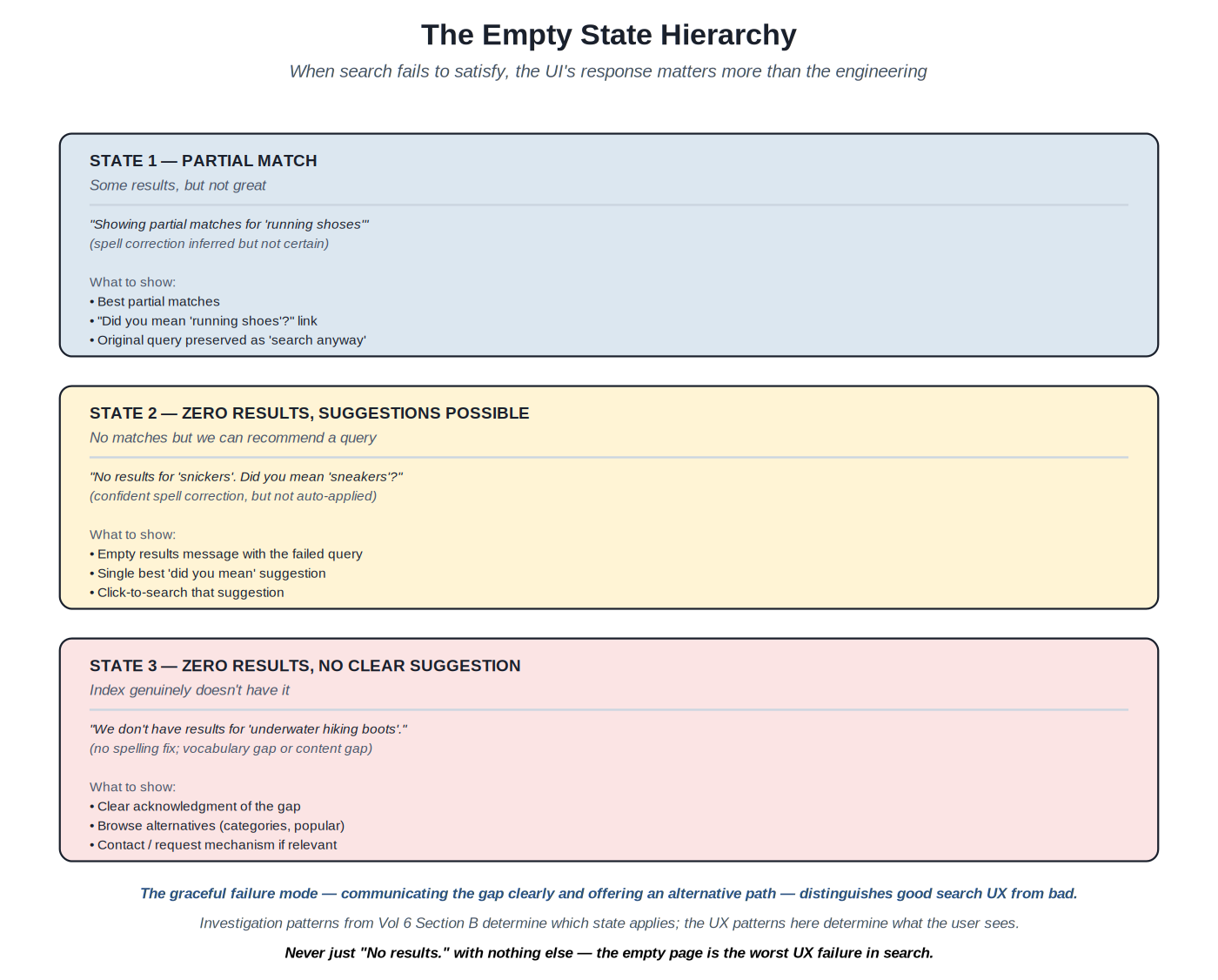
The empty state hierarchy and graceful failure patterns #
Source: Production search UX methodology; UX writing literature; Volume 6 zero-result investigation patterns
Classification — Patterns for handling the various forms of search failure — partial matches, zero results with suggestions, zero results without suggestions — in user-facing ways.
Convert search failure modes into useful user interactions by acknowledging the failure clearly, offering alternative paths forward, and preserving user agency.
The worst UX failure in production search is the bare "No results" page with no alternatives, no suggestions, no path forward — the user is stuck. This pattern still appears commonly in production search. Even minimal alternatives substantially improve the empty-state experience; substantial alternatives transform it from a dead-end into a redirection opportunity.
State 1: partial match. The system found some results but they're weak (low scores, spell correction inferred but uncertain). UX response: show the partial results with a banner explaining the situation ("Showing partial matches for X"); offer the inferred query as a one-click switch; preserve the original query as a fallback ("search instead for..."). The pattern communicates uncertainty honestly while preserving user control.
State 2: zero results, suggestions possible. The system has nothing for the query but has a confident alternative (typically from spell correction or query expansion). UX response: an empty-results page with the failed query prominently displayed; a clear suggestion as the primary affordance ("Did you mean X?" as a large clickable element); the original query preserved (the user might want to try a different reformulation or contact support). Production patterns avoid auto-applying corrections in zero-result cases because the auto-apply would hide the failure from the user.
State 3: zero results, no clear suggestion. The system has nothing and no good alternative — a genuine content gap or vocabulary gap. UX response: clear acknowledgment of the gap; suggested alternative paths (browse categories, popular content); contact or request affordances where relevant; a description of what kinds of things the search does cover, so the user understands the scope. The state should feel like helpful redirection, not failure.
Content for empty states. The text matters substantially. Bad patterns: "No results found." (cold, blocking, no path forward). Good patterns: "We couldn't find products matching 'X'. Try browsing our running shoe categories below, or check your spelling." (warm, redirecting, offers paths forward). UX writing guidance: acknowledge the failure clearly without blaming the user; describe what was tried; offer alternatives; maintain brand voice. Production teams often have UX writers contribute to empty-state copy because the content has substantial impact on perceived quality.
Filter dead-ends. A specific failure case: the user applied filters that collectively eliminate all results. UX response: explicitly call out the filter combination as the cause; suggest removing specific filters ("Remove 'size 14' to see 47 more results"); offer a "clear all filters" affordance. The pattern educates the user about which filter is most restrictive; without it, the user has to manually try removing each filter to find the path forward.
Suggestions in empty states. Empty states are the right place for assertive suggestions. Patterns: top related searches (queries similar to the failed one that did produce results); popular searches in this section/category; recently viewed items (for logged-in users — something the user has shown interest in); featured or curated content (when the team wants to direct attention). The suggestions should be tailored to context: a zero-result query in the shoe department should suggest shoe alternatives, not generic store-wide popular items.
Logging and operational integration. Empty states are operationally important — Volume 6 Section B documented the investigation cycle. The UX should support the operational discipline by capturing what the user does next: did they click a suggestion? Did they reformulate? Did they leave? Did they contact support? Each behavior is a signal about whether the empty-state UX worked. Production patterns: log empty-state events with the failed query; track subsequent user actions; correlate with whether the user eventually found what they wanted (or didn't).
Mobile considerations. On mobile, empty states need to be especially well-designed because the user has fewer fallback paths (no easy sidebar for filters, fewer affordances visible at once). The empty state should fit on one screen without scrolling; the primary suggestion should be obvious and large; the path back should be one tap. The discipline is harder on mobile but more important — users abandon mobile search more readily than desktop, and good empty-state UX retains them.
Every search system. The patterns are foundational; even simple search benefits from non-trivial empty-state handling. The investment is modest (mostly content design plus modest implementation work); the returns are substantial because the failure cases compound badly without it.
Alternatives — none for serious search UX. Some systems show "contact support" as the only path in empty states; this works for very limited contexts but underuses the available alternatives. Some show generic browse links; this is better than nothing but suboptimal. The contextual, redirective pattern documented here is the production default.
- Production search UX methodology writings
- Volume 6 of this series for the operational investigation patterns
- UX writing literature (Microsoft Style Guide, Mailchimp Voice and Tone, etc.)
Section F — Mobile and responsive search UX
The constraints and patterns specific to smaller screens and touch interaction
Mobile search is different. Smaller screens mean less can be visible at once; touch interaction has different ergonomics than mouse; users on mobile are often in different contexts than users on desktop. The patterns in this section document the mobile-specific patterns that production search teams use.
Mobile-specific search UX patterns and responsive design #
Source: Production mobile UX methodology; iOS and Android design guidelines; touch interaction research
Classification — Patterns for designing search UX that works well on mobile devices alongside (or instead of) desktop.
Adapt search UX patterns to mobile constraints — small screens, touch input, slower networks, different user contexts — while maintaining the affordances that make search useful.
Search UX designed primarily for desktop often translates badly to mobile. Facet sidebars don't fit alongside results; autocomplete keyboard navigation is irrelevant when there's no keyboard; result cards that work at desktop density become unscannable at mobile sizes; touch targets that work fine with a mouse become frustratingly small on a finger. Production mobile search needs design patterns that respect mobile constraints rather than just shrinking desktop UX.
Search input. Mobile search input typically takes the full screen width and is visually prominent at the top of the page. Patterns: large enough touch target (44+ pixels tall per WCAG); appropriate keyboard type (search on iOS, with the search-action key on the return button); voice input affordance (microphone icon launching speech-to-text); clear-input affordance (X button to clear the current query); no zoom-on-focus (set font-size 16+ to prevent iOS auto-zoom). The input should feel substantial and discoverable, not hidden in a corner.
Autocomplete on mobile. The autocomplete dropdown behaves differently. Patterns: the dropdown takes substantial vertical space (often half the visible screen); suggestions are individually larger (44+ pixels per touch target); fewer sources are shown (typically 2–3 sources blended, not 4–5); selecting a suggestion submits immediately rather than just filling the input (mobile users want results, not edit operations); recent searches are emphasized because they're easier than typing on mobile.
Result cards. Mobile cards typically stack in a single column at full width. Patterns: image and key information visible without scrolling per card; price/primary metadata immediately below title (don't bury); action affordances (cart, save) as taps rather than hover; cards should be tappable as a whole, not require precise targeting of the title link; sufficient vertical spacing between cards to avoid mis-taps. Card density on mobile is typically lower than desktop (4–6 results visible at a time vs 8–12 on desktop) because each card needs more vertical space.
Filters on mobile. The desktop sidebar pattern doesn't fit on mobile screens. Production patterns: "Filter" button that opens a modal or full-screen drawer; the drawer shows all facet groups with the same structures as desktop; an "Apply" button at the bottom of the drawer commits changes (don't apply on every interaction — too disruptive on mobile); a count of pending changes shown on the apply button ("Apply (3 filters)"); the drawer dismissible without applying (Cancel button); badges on the filter button showing how many filters are currently active. The pattern is universal enough that users learn it once and apply it across mobile apps.
Sorting on mobile. Sort controls follow a similar drawer pattern: a "Sort" button that opens a bottom sheet or modal with sort options. Single-select radio buttons for the available sort orders. Apply on selection (sort is simpler than multi-filter so immediate application works). Production patterns: combine sort and filter into a single bottom toolbar; show the current sort option on the toolbar ("Sorted by: Price low to high") so users see the state.
Search-as-you-type vs submit. On desktop, results often update as the user types (incremental search). On mobile, this pattern can be disruptive — the network request for every keystroke is expensive on cellular; the result updates create motion that's distracting on small screens. Production patterns: prefer submit-driven search on mobile (user taps the search button or selects an autocomplete suggestion); use autocomplete to handle the incremental discovery; reserve search-as-you-type for very fast backends and contexts where the user expects it.
Touch ergonomics. The thumb-zone matters on mobile: users hold phones in ways that make some areas easier to reach than others. The most common one-handed grip puts the thumb closest to the bottom-right (right-handed) of the screen. Important affordances should be in reachable zones: primary search input at the top is OK (users use both hands when actively searching); apply/submit buttons should be in the bottom-right or bottom-center; back/cancel in the top-left. The patterns aren't absolute but they're informed by how users actually hold phones.
Network resilience. Mobile networks are slower and less reliable than desktop. Patterns: aggressive caching of repeated searches; skeleton screens during loading (Section B); optimistic updates where appropriate; offline messaging when the network fails ("You're offline. Showing recently viewed."); retry affordances. The discipline is treating network failure as a normal case rather than an exception.
Responsive design. The same codebase often needs to serve both mobile and desktop. Patterns: design mobile-first (start with the constrained mobile design, scale up to desktop); use CSS media queries to switch layouts at breakpoints; test on actual devices (emulators miss many issues); consider conditional component rendering (the mobile filter drawer vs desktop sidebar may be different components rather than the same component restyled). The technical patterns are standard responsive web design; the design discipline is making sure the mobile experience is genuinely good rather than just usable.
Any search system that serves mobile traffic. For consumer search, mobile is typically the majority of traffic and may be over 80% in some categories. Even for enterprise search, mobile usage has grown substantially through 2024–2026. Mobile-first design is the default in modern web work.
Alternatives — desktop-only search for tightly scoped use cases (internal admin tools, specialized B2B). Native mobile apps as alternative to mobile web (the patterns documented here apply with platform-specific adaptations for iOS and Android).
- Apple Human Interface Guidelines (developer.apple.com/design/human-interface-guidelines)
- Google Material Design guidelines (m3.material.io)
- Production mobile search UX writings
- Touch interaction research (Hoober, 2013 on thumb zones; Fitts's law applications)
Section G — Conversational and voice search
Emerging patterns through 2024–2026 as LLM-based interfaces become production-viable
Search is increasingly conversational. LLM-based interfaces let users ask questions in natural language and get synthesized answers; voice interfaces remove the keyboard entirely. The patterns in this section document the emerging conventions for these surfaces.
Conversational search UX patterns with answer synthesis and citation #
Source: Production methodology at AI-first search products (Perplexity, You.com, Google AI Overviews, Bing Chat); RAG application UX patterns through 2024–2026; Anthropic and OpenAI conversational AI guidance
Classification — Patterns for surfacing LLM-synthesized answers alongside or instead of traditional result lists.
Provide conversational answer experiences that satisfy informational and analytical queries directly while preserving the user's ability to verify sources and explore further.
Traditional search returns documents; users still have to read them and synthesize the answer themselves. For informational queries ("what are the common signs of vitamin D deficiency", "how do I file a tax extension"), the user wants the answer, not a list of articles. Conversational search synthesizes the answer from retrieved documents and presents it directly. The UX patterns for this are still emerging but consolidating around several conventions documented here.
The synthesis surface. Above or instead of the result list, the system presents a synthesized answer to the query. The answer is typically: a few sentences to a paragraph of natural-language text; with inline citations to the documents that informed the answer (footnote-style numbers, hyperlinks, or pill-shaped chips); with the source documents shown below for verification. The pattern is the RAG (retrieval-augmented generation) interface that emerged through 2023–2024 and consolidated through 2025–2026.
Citations. Citations are essential for trust. Each statement in the synthesized answer should be traceable to source documents. Patterns: inline numbered citations linked to the source list ([1] [2] [3]); hover or click reveals the cited source snippet; the source document is one click away for full reading. Without citations, users can't verify the synthesis, and the answer feels less trustworthy regardless of accuracy. Production systems emphasize citation visibility; the absence of citations is a quality signal users have learned to be wary of.
Hallucination handling. LLMs sometimes synthesize answers that aren't supported by the retrieved documents — hallucinations. UX patterns to mitigate: cite specific spans of source documents rather than just listing sources at the end; show the source snippets prominently; allow the user to dispute or report incorrect answers; never auto-present synthesized answers for high-stakes domains (medical, legal, financial) without explicit caveats. The discipline is treating the synthesis as a draft for the user's consideration rather than as authoritative output.
Follow-up and conversation. Conversational search lets users ask follow-up questions in context. "What are the common signs of vitamin D deficiency" → "How do you test for it?" → "What dosage is recommended?" Each question builds on the prior context. UX patterns: conversation thread display (each Q&A as a turn); context preservation (the next question understands the prior context implicitly); explicit context controls (clear conversation, start over). The conversational pattern is fundamentally different from the stateless query/results pattern; it requires different state management and different UI.
Mixed presentation. Many systems combine synthesis with traditional results: the synthesis appears at the top of the page; the traditional result list below offers more depth. The user can choose: read the answer and move on, or scan the results for more comprehensive coverage. The pattern works well for queries that have both a direct answer and broader exploration value.
When to synthesize vs return results. Not every query benefits from synthesis. Navigational queries ("Nike homepage") want the link, not an essay. Transactional queries ("buy running shoes") want product listings, not a summary of what running shoes are. Informational queries ("what is BM25") benefit from synthesis. The Volume 2 intent classification can route queries to synthesis-vs-list pathways. Production patterns: synthesize selectively based on query type; default to traditional results for ambiguous cases.
Voice search. Voice input adds another dimension. Users speak their query; the system transcribes via speech-to-text; the synthesis is read back via text-to-speech (or both displayed and spoken in a multimodal interface). UX patterns: clear feedback during recording (waveform, listening indicator); transcription confirmation (the user can see what was transcribed before submitting); fallback to text if transcription fails or feels uncertain. Voice search works well for some contexts (hands-free, accessibility, mobile while walking) and poorly for others (lengthy queries, contexts requiring privacy); production deployments offer voice as an option, not exclusive mode.
Cost and latency. Conversational search has different operational characteristics than traditional search. LLM inference is more expensive than retrieval (often 10–100x per query); latency is higher (1–5 seconds typical vs 100ms for traditional results); failure modes are different (the LLM may produce wrong or biased synthesis even when retrieval works). Production patterns: caching for common queries (reduces both cost and latency); streaming the synthesis as it generates (perceived latency improves substantially with streaming); fallback to traditional results if the LLM fails or times out; cost budgets enforced at the system level. The patterns are still maturing; teams deploying conversational search should expect to invest in operational sophistication.
Search workloads with substantial informational queries that benefit from synthesis. Knowledge bases. Documentation search. Research-style search. Some categories of e-commerce (comparison shopping where synthesis helps). Workloads where the cost and latency are justified by the quality improvement.
Alternatives — traditional results-only search where the workload is mostly navigational or transactional. Hybrid systems (synthesis for some query types, traditional for others) are common and often the right choice. The pure-conversational interface is most appropriate for explicitly conversational products (Claude, ChatGPT, Perplexity), not for traditional search systems where users expect results lists.
- Production methodology writings from Perplexity, You.com, Google, Bing on AI-search UX
- Anthropic Claude documentation on conversational interfaces
- RAG application UX literature (LangChain, LlamaIndex documentation)
- Volume 10 of the agentic AI series (RAG patterns)
Section H — Discovery and resources
Where to track search UX discipline as the field evolves
Search UX draws from broader UX/UI design, accessibility, and information architecture. The discipline continues to evolve as conversational interfaces and AI-augmented search reshape user expectations.
Resources for tracking search UX discipline #
Source: Multiple practitioner, academic, and design-resource sources
Classification — Sources for staying current on search UX practice.
Provide pointers to the active sources of search UX knowledge across design, accessibility, and emerging conversational interfaces.
Search UX sits at the intersection of multiple disciplines: search engineering, UX design, accessibility, content design, information architecture. The discipline doesn't have a unified literature; practitioners assemble understanding from multiple sources.
Foundational texts. Hearst, Search User Interfaces (Cambridge, 2009; free online at searchuserinterfaces.com) — the canonical reference for search UX even though dated; many patterns remain current. Russell, Mindshare: A Field Guide to Search Behavior (2024) — contemporary observations on how users actually search. Morville and Callender, Search Patterns (O'Reilly, 2010) — the IA-side perspective on search interface design; many examples are dated but the framing remains useful.
Accessibility resources. WAI-ARIA Authoring Practices (w3.org/WAI/ARIA/apg/) — the canonical reference for accessible component patterns; the combobox, listbox, group, slider patterns directly apply to search UX. WCAG 2.1 / 2.2 success criteria (w3.org/WAI/WCAG21/) — the accessibility requirements that apply to search UX. WebAIM articles on form and search accessibility (webaim.org/articles/). Inclusive Components by Heydon Pickering (inclusive-components.design) — production patterns for accessible web components including comboboxes.
Design system documentation. Major design systems include substantial search UX patterns: Material Design (m3.material.io), Apple Human Interface Guidelines (developer.apple.com/design/human-interface-guidelines), Microsoft Fluent (fluent2.microsoft.design), GOV.UK Design System (design-system.service.gov.uk). The patterns are battle-tested in production at scale; even teams not using these design systems benefit from studying the search-relevant components.
Practitioner writing. UX research firms (Nielsen Norman Group, Baymard Institute) publish substantial search UX research; the Baymard E-commerce Search UX research is particularly thorough for retail. Algolia's UX team publishes case studies and pattern documentation. Major search teams (Etsy, Wayfair, Spotify) periodically publish UX case studies.
Tools and libraries. Component libraries with strong search UX implementations: Algolia Autocomplete and React InstantSearch; Headless UI (headlessui.com); Radix UI (radix-ui.com); React Aria from Adobe (react-spectrum.adobe.com/react-aria); Mantine search components. The libraries handle the accessibility and interaction patterns correctly so teams don't reinvent them.
Conversational AI UX. AI-first product design literature is emerging: Anthropic's product documentation on conversational interfaces; OpenAI's ChatGPT design discussions; Perplexity's public design choices documented in their blog. The conventions are consolidating through 2025–2026.
Communities. UX design communities (Designer Hangout, ADP List, IxDA local chapters). Search-specific UX rare but emerging; Relevancy Engineering Slack has a #ux channel.
Emerging areas. Conversational and generative search UX is the most active emerging area through 2024–2026. AI-augmented faceted search (LLM-generated facet suggestions, semantic clustering of results) is appearing in production. Multimodal search UX (image-based, voice-based, gesture-based) is appearing in specialized products. Privacy-respecting search UX (under tightening regulations) is becoming distinct from analytics-rich UX.
UX designers working on search products. Search engineers designing UX components. Product managers prioritizing UX investments. Continuous education as patterns evolve.
Alternatives — specialized UX consulting for high-stakes engagements. Internal design systems for teams with mature practice. The combination of external tracking and applied judgment is the working pattern.
- Hearst, Search User Interfaces (Cambridge, 2009; free online)
- Morville and Callender, Search Patterns (O'Reilly, 2010)
- WAI-ARIA Authoring Practices (w3.org/WAI/ARIA/apg/)
- Baymard Institute E-commerce Search UX research
- Nielsen Norman Group search research articles
- Major design system documentation (Material, HIG, Fluent, GOV.UK)
Appendix A — Pattern Reference Table
Cross-reference of the search UX patterns covered in this volume.
| Pattern | Provides | When to use | Section |
|---|---|---|---|
| Hybrid autocomplete | Multi-source query shaping | Most consumer search | Section A |
| Result cards with snippets | Visible ranked retrieval | All search systems | Section B |
| Query-aware highlighting | Communicate match relevance | Lexical search results | Section B |
| Multi-select facets | Refinement on orthogonal attrs | E-commerce, content search | Section C |
| Range facets | Numeric refinement (price, date) | Wherever continuous attrs exist | Section C |
| URL state for filters | Bookmarkable, back-button safe | All faceted search | Section C |
| Did-you-mean (confidence-tiered) | Recover from spelling errors | All search; consumer especially | Section D |
| Empty state hierarchy | Graceful failure modes | All search systems | Section E |
| Mobile filter drawer | Refinement on small screens | All mobile search | Section F |
| Conversational synthesis + citations | Direct answers with sources | Informational queries | Section G |
Appendix B — The Search Engineering Series
This catalog is Volume 7 of the Search Engineering Series. The current state of the series:
- Volume 1 — The Search Patterns Catalog (delivered) — query-time architectural patterns.
- Volume 2 — The Query Understanding Catalog (delivered) — the methods that produce structured query signals.
- Volume 3 — The Indexing and Document Engineering Catalog (delivered) — document-side preparation.
- Volume 4 — The Ranking and Relevance Catalog (delivered) — scoring, LTR, neural rerankers.
- Volume 5 — The Search Evaluation Catalog (delivered) — metrics, judgment, online evaluation.
- Volume 6 — The Search Operations Catalog (delivered) — the day-to-day workflow.
- Volume 7 — The Search UX Patterns Catalog (this volume) — the visible surfaces of the engineering.
- Volume 8 — The Search Platforms Survey (planned) — platform comparison.
With Volume 7 delivered, the series has seven of its eight planned volumes. The first six cover the engineering disciplines and operational practice; Volume 7 covers the presentation surfaces that translate engineering investment into user value. Only Volume 8 (Platforms Survey, for platform comparison) remains — a less foundational volume that's most valuable for teams choosing or migrating between platforms.
Appendix C — The Seven-Volume Library
With Volume 7 delivered, the Search Engineering Series has expanded from its six-volume working foundation to a seven-volume library covering both engineering and user-facing aspects of production search. The structural shape of the library:
Volumes 1–5 cover the technical disciplines: architectures, query understanding, indexing, ranking, evaluation. These are the algorithmic and methodological foundations of search engineering. Volume 6 covers the operational practice that uses them daily. Volume 7 covers the presentation surfaces that make the engineering visible to users. Together, these seven volumes cover the work of building, operating, and presenting production search systems.
How Volume 7 integrates with the rest. The UX patterns documented here surface the work of Volumes 1–6. Autocomplete (Section A) consumes Volume 2 query understanding outputs and Volume 6 query log analytics. Result cards (Section B) display the documents Volume 3 indexed in the order Volume 4 ranked, with highlighting from Volume 2 analyzer output. Facets (Section C) present Volume 3 schema decisions as refinement controls. Did-you-mean (Section D) surfaces Volume 2 spell correction. Empty states (Section E) implement the response to the failure modes Volume 6 investigation surfaces. Mobile patterns (Section F) and conversational patterns (Section G) re-apply the engineering across different surfaces.
Why this volume earns inclusion in the working library. Some series stop at engineering and leave UX to the design team. This series' perspective is that search engineering practice includes the UX patterns where engineers have substantial leverage — component structure, accessibility implementation, snippet generation, state management. These aren't pure design questions; they're cross-disciplinary engineering questions that the search engineer should be fluent in. Excluding them would leave the working library incomplete; including them as Volume 7 acknowledges that effective production search includes the presentation layer.
What's left. Volume 8 (Platforms Survey) is the remaining planned volume. It compares Elasticsearch, OpenSearch, Solr, Coveo, Algolia, Vespa across the dimensions covered in Volumes 1–7: how each platform implements retrieval, query understanding, indexing, ranking, evaluation tooling, operational support, and UX integration. The volume is valuable for teams choosing or migrating between platforms but less foundational than the prior seven — most teams are settled on their platform and need depth in that platform rather than breadth across platforms. The seven-volume library is sufficient for most production work; Volume 8 is the situational extension.
Reading order for new practitioners. For someone new to search engineering: Volume 1 (architecture vocabulary) → Volume 5 (measurement discipline) → Volume 6 (operational practice) → Volumes 2, 3, 4 (technical disciplines for specific projects) → Volume 7 (UX implementation). The order grounds in framing and measurement before specializing into technical work, then surfaces the user-facing implications. Experienced practitioners can read any volume standalone with the cross-references for integration.
Consulting application. For consulting engagements, Volume 7 fills a specific gap. Backend assessments produce recommendations about retrieval, ranking, indexing; those recommendations only translate into client value if the UX surfaces them well. Engagements that include UX recommendations alongside backend ones produce more durable improvements because the client team can implement the full picture, not just the engineering side. The seven volumes together support full-stack consulting; each volume covers a domain that may be relevant in any given engagement.
Appendix D — Discovery and Standards
Resources for tracking search UX discipline (consolidated from Section H):
- Foundational texts: Hearst, Search User Interfaces (Cambridge, 2009; free online); Morville and Callender, Search Patterns (O'Reilly, 2010); Russell, Mindshare (2024).
- Accessibility: WAI-ARIA Authoring Practices; WCAG 2.1 / 2.2; WebAIM articles; Inclusive Components by Heydon Pickering.
- Design systems: Material Design; Apple HIG; Microsoft Fluent; GOV.UK Design System.
- Practitioner research: Nielsen Norman Group; Baymard Institute (e-commerce search UX); Algolia UX team publications.
- Component libraries: Algolia Autocomplete, React InstantSearch; Headless UI; Radix UI; React Aria; Mantine.
- Conversational AI UX: Anthropic Claude documentation; OpenAI design discussions; Perplexity design choices.
- Communities: UX design communities (Designer Hangout, ADP List, IxDA); Relevancy Engineering Slack.
Three practical recommendations. First, the WAI-ARIA Authoring Practices document is essential reading for any engineer implementing search UX components — the combobox, listbox, and group patterns directly apply to autocomplete and facets, and getting them wrong produces accessibility failures that are difficult to fix later. Second, the Baymard Institute's e-commerce search UX research is the most empirically rigorous publicly available work on production search UX; even teams not in e-commerce benefit from studying their patterns. Third, conversational search UX (Section G) is the most active emerging area; teams planning new search products in 2025–2026 should consider whether conversational patterns are appropriate for some portion of their workload.
Appendix E — Omissions
This catalog covers about 10 patterns across 8 sections — the search-UX core. The wider UX discipline includes much that isn't covered here:
- General UI design principles (typography, color, layout grids, visual hierarchy beyond search-specific applications). Covered in general UX/UI literature.
- Content design and UX writing in depth (voice, tone, microcopy, error message construction). Covered in content design literature; UX Writers Group, Microsoft Style Guide.
- Information architecture beyond search (site navigation, taxonomies, wayfinding). Covered in IA literature (Morville, Rosenfeld).
- Search-result merchandising in depth (boosting, pinning, promotion, sponsored placements). Adjacent to ranking (Volume 4) and UX; product-specific.
- Personalization UX patterns beyond recent searches (recommendations, user preferences, behavioral targeting). Adjacent to recommendation systems.
- Cross-search-product UX (search across multiple search systems, federated search interfaces). Specialized topic.
- Search analytics dashboards for product owners (not engineers). UX patterns for non-technical users of search data.
- Visual search UX in depth (image-based queries, augmented reality search). Emerging area; specialized patterns.
- Specialized vertical search UX (legal, medical, scientific) with their domain-specific conventions.
- Internationalization and localization beyond what was covered (RTL languages, character-set handling in result display).
Appendix F — The Cross-Disciplinary Position
Volume 7 occupies a structurally different position than Volumes 1–6 — sitting at the intersection of search engineering and UX design rather than within either discipline alone. The position shapes how the volume should be read.
Where the volume sits. Search engineering is the algorithmic and methodological foundation: how to retrieve, rank, index, evaluate, and operate search systems. UX design is the interaction discipline: how interfaces work for users. Search UX is the cross-disciplinary domain where both apply. The patterns in this volume aren't purely engineering (they require UX skills to design well) and aren't purely design (they require engineering understanding to implement well). The volume is written for practitioners who need to span both.
Why this matters for the library. The first six volumes cover engineering and operations — the disciplines where search engineers have clear ownership. Volume 7 covers the disciplines where ownership is shared with UX designers and content writers. Some search engineers may be tempted to skip Volume 7 because it's "not their domain"; the volume's argument is that effective production search engineering includes substantial UX work, and engineers who don't engage with that work leave value on the table. The Bass Pro Shops type of engagement consistently surfaces UX issues that the engineering team has the leverage to address but hasn't.
How the volume should be read. As reference material for the patterns that exist at the engineering-UX boundary. The reader doesn't need to become a UX designer; they need to be fluent enough in the patterns to make good implementation decisions, collaborate effectively with UX designers, and recognize when UX work is needed. The Fowler-style template applies but the artifacts are different from prior volumes — component structure and accessibility considerations rather than algorithms.
The consulting consequence. For practitioners working with clients, Volume 7 fills a specific consulting gap. Most search consulting engagements eventually surface UX issues that the engineering investigation didn't initially target: snippets that don't communicate relevance, facets that overwhelm or underwhelm, autocomplete that suggests poorly, empty states that dead-end users. Without Volume 7 as reference, the consultant can only flag these issues for the client's UX team to address separately. With Volume 7, the consultant can recommend specific patterns and provide enough implementation guidance that the client team can address the issues in coordination with their UX designers. The integration is more productive than the alternative.
The next volume. With Volume 7 delivered, only Volume 8 (Platforms Survey) remains planned. The seven-volume library is sufficient for most production search engineering practice; Volume 8 is the situational addition for teams choosing or migrating between platforms. Whether to write Volume 8 depends on demand; the series has reached its working completeness without it.
— End of The Search UX Patterns Catalog (Volume 7) —
— Volume 7 of the Search Engineering Series —